B2B organizations are usually late to the YouTube party. They’re slowly starting to wake up to the usefulness and effectiveness of this marketing channel…thank goodness!
Your organization is likely doing one of two things right now with YouTube:
- There’s no YouTube presence at all. Your channel isn’t set up—or it’s there but it’s just a placeholder for your brand with zero videos published.
- There’s sort of a YouTube presence. But it’s a dumping ground for webinar recordings and random self-serving videos you just need to host somewhere.
Here’s a golden nugget from new research about web traffic from Datos and SparkToro…
When it comes to the web’s top 170 traffic-referring domains, Google continues to dominate. No surprises there.
But, guess who’s tied with Facebook in second place? YouTube.
Guess who’s not on the winner’s podium? B2B social media faves: X (formerly Twitter) and LinkedIn.
Since you’re investing in video marketing, doesn’t it make sense to put more time and energy into the one channel that is solely dedicated to video? Because the answer is “Hell yeah!,” let’s optimize your YouTube channel.
How to Set Up Your YouTube Channel
If you’re just setting up your YouTube channel, this part is obviously for you. But, stick with me even if you already have an existing channel because I’ll bet you can make some small but substantial improvements.
Your YouTube channel is just like your website homepage. You have a few seconds to win someone over before they bounce. Keep this in mind as you’re setting up your YouTube channel, and take the time to do it right.
Oh…before we get into setup details, I’ll give you some directions to help you find all this shit in the backend because YouTube is surprisingly not very intuitive.
When you go into YouTube Studio, all the setup stuff is not located in “Settings” (eye roll). You have to go to “Customization.”
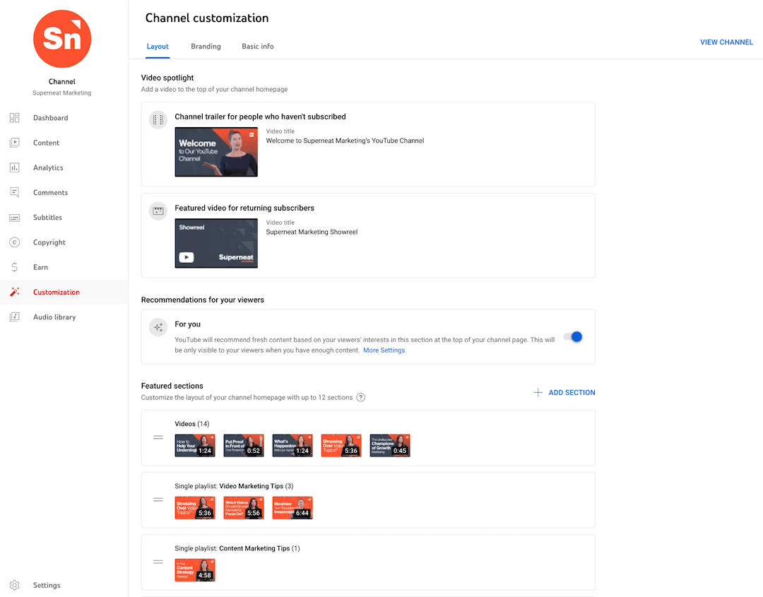
Create a Phenomenal YouTube Channel Trailer
Your trailer is incredibly important since it’s the very first thing someone sees when they land on your YouTube channel. Because it auto-plays, people pretty much have to stop and take notice.
The primary goal of a channel trailer is to convert YouTube visitors into subscribers. Without a trailer, you’re depending way too much on your thumbnails and titles on your videos to do all the talking—keep in mind that your channel visitor may not take the time to watch a single video.
Ideally, you will have a YouTube channel trailer that welcomes new visitors who haven’t subscribed and you will have a different video for returning subscribers.
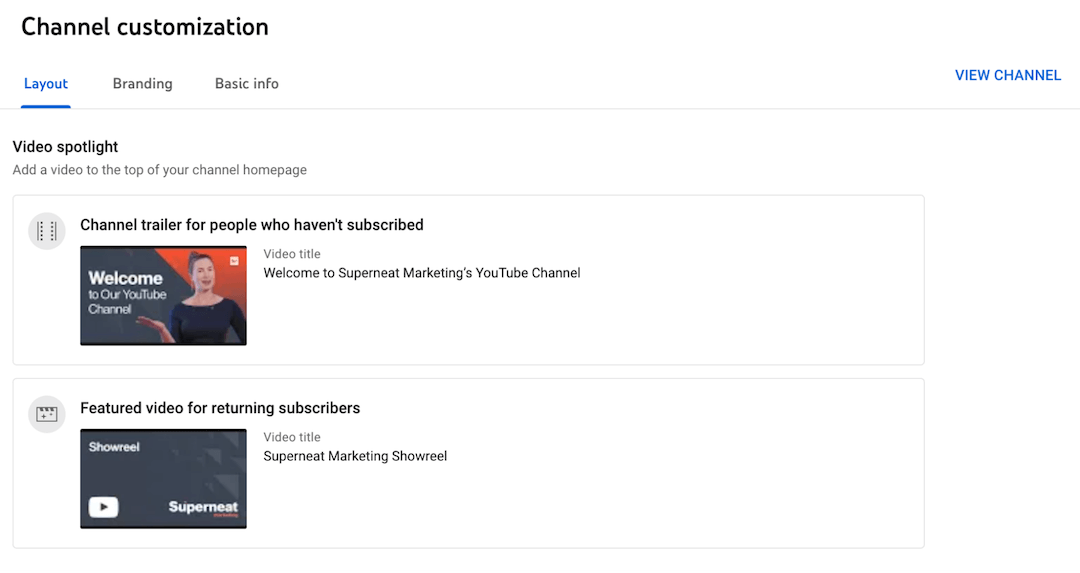
The biggest mistake I see organizations make is to use a brand video with a “what we do” message as their YouTube channel trailer.
A brand video like this can work for returning subscribers—like we do on our channel with our Superneat Marketing Showreel. But new visitors who haven’t subscribed need to watch a YouTube channel trailer first to understand what you and your channel are all about.
Here’s the trailer we did for Superneat’s YouTube channel if you need inspiration…
Create Playlists to Guide Their Viewing Experience
YouTube playlists often get neglected. But, organizing your videos into playlists is one of the best ways to improve the user experience for your audience and prolong engagement. They’re easy to scan when someone shows up on your channel, so they can pick and choose videos that pique their interest.
Make it easy for viewers to go down the rabbit hole by grouping content based on the criteria that your audience cares about. Play around with your playlists, grouping them by things like topic, length, or series name.
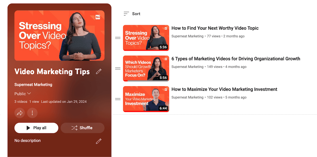
Since YouTube is purely focused on providing valuable content to your audience, I don’t recommend sharing straight-up self-serving content (i.e. brand or product marketing videos, and even, testimonials). However, you could create a playlist just for these videos and name it accordingly. I would only do this if you are sharing value-driven content the majority of the time.
Lastly, a cool idea B2B organizations can borrow from other non-B2B channels is the “start here” playlist. I see this on a lot of the channels I watch in my free time. I think a “start here” playlist is a great way to warm people up to your channel with introductory and/or popular video content.
Pictured below: The Blowout Professor, a channel I’m currently hooked on that also made me realize I’ve been washing my hair incorrectly for 40+ years. Highly recommend it for no-BS hair care, but also, for a value-driven YouTube content example to follow.

Layout Resources
Display Eye-Catching, On-Brand Graphics
Brand graphics are a self-explanatory must-have for your YouTube channel, so I’ll keep this short. It’s similar to the design needs for your social media company profiles.
You need to make a crispy profile image (small logo icon) and banner image (larger logo and maybe a tagline). Always test your banner on multiple devices to make sure logos and text are placed properly. Skip those DIY Canva graphics and have a designer take care of these so they look good on any device.
Branding Resources
Include a Punchy Tagline and Concise Description
Okay, the YouTube channel tagline has driven me mad in the past. I eventually figured out how to get it right, so I’ll save you the agony.
Even though the tagline is prominent on the channel, in the backend, it’s just the beginning of your description. There is no specific spot in the backend to add your tagline (cue: more eye rolls).
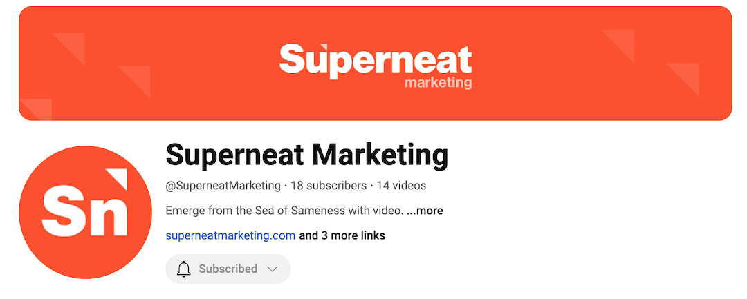
Because of this wonky tagline situation, view your channel after you get the tagline in at the beginning of your description to check that it isn’t cut off. You may need to experiment with wording a bit to get the length dialed. You want the tagline to be intact, ahead of the “more” option where someone can view the rest of your channel description.
For the tagline content, I recommend going with a punchy one-liner that embodies your brand’s whole vibe. It will borrow from your mission statement and/or your value proposition statement. Make that the first sentence of your description, then add a line break before you get into a more detailed but concise description that covers what your brand is about and what your channel is about.
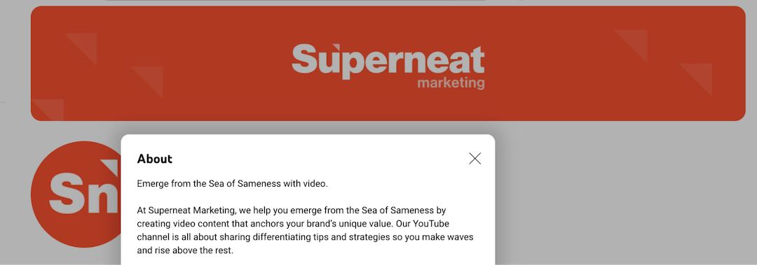
If this “what we’re about” business sounds eerily familiar in the description, that’s because we just discussed this in the trailer section. Your YouTube description will mirror the content in your YouTube channel trailer.
Link to Your Relevant Website Pages
You know how most social media and content platforms are super stingy with links? Definitely not the case with YouTube.
You can add 14 links to your channel. I know, right?! But, don’t do that because 14 links are overkill. I’d stay in the vicinity of 3-5 links to avoid causing your visitors to deal with decision paralysis.
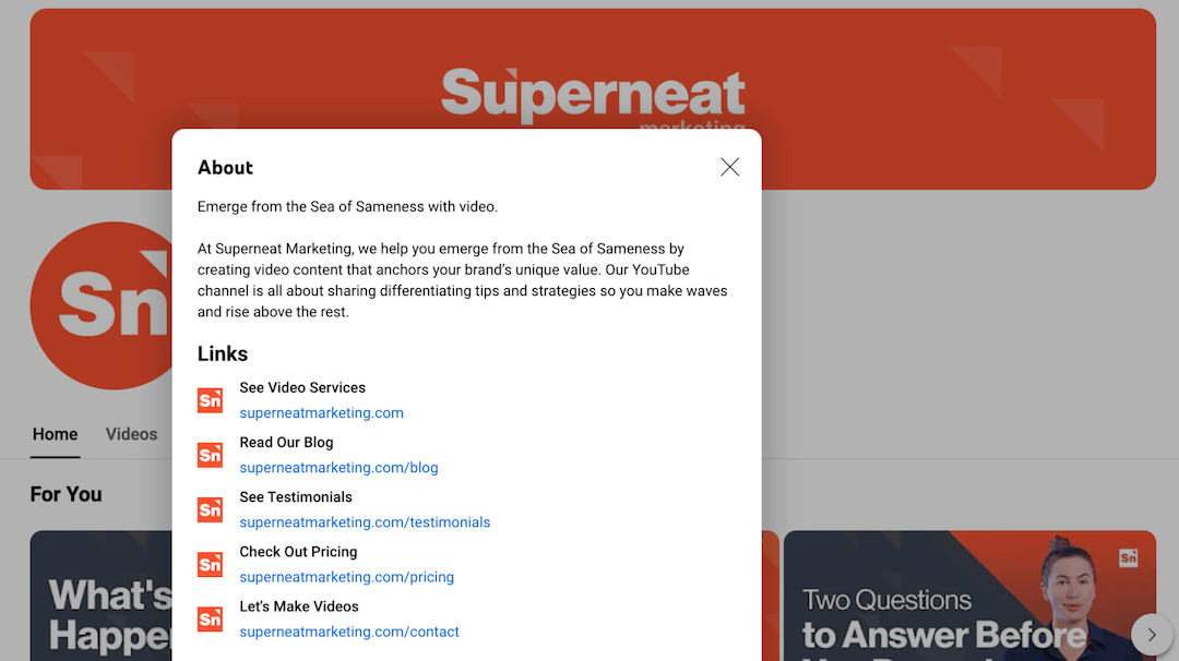
So, how do you choose your channel’s links?
I’d say to go the evergreen route with select website pages that you want to drive traffic to. You could link to a popular asset (i.e. eBook) as long as the landing page link will be around for the long haul. I would avoid any links that will change over time because I guarantee you will forget to go back to update this YouTube link down the road.
For the order of the links, whichever link you have first will be visible and most easily clickable to your visitors on your channel page.
Personally, I recommend making this first link your homepage URL so you’re not selling too hard by sending people straight to a page with a form or pricing. But, do whatever your little heart desires. Experimenting with this valuable linking real estate on your YouTube channel is smart!
Basic Info Resources
How to Properly Publish Every Video
Okay, now your channel is optimized—it looks amazing, it’s inviting, it’s converting visitors into subscribers and driving potential customers to your website. Now, let’s get into video publishing.
Video publishing covers a lot of ground. Similar to the setup section, I’ll focus on the highlights. Otherwise, we’ll be here all day.
Since we compared your website homepage to your YouTube channel, I’ll make another comparison here as well: Video publishing is just like blog publishing. Meaning that it’s fairly simple to execute but it has to be executed perfectly. Also, what you include and how you format matters for your viewer’s experience and YouTube’s policies.
Don’t Worry About Tags
Tags are kind of a controversial topic, with YouTubers being divided on whether or not they’re effective for searchability anymore. Plenty of YouTubers still add tags to every video. I’ve even seen some YouTubers painstakingly researching and comparing video metrics because they’re skeptical about tags not being effective or relevant anymore.
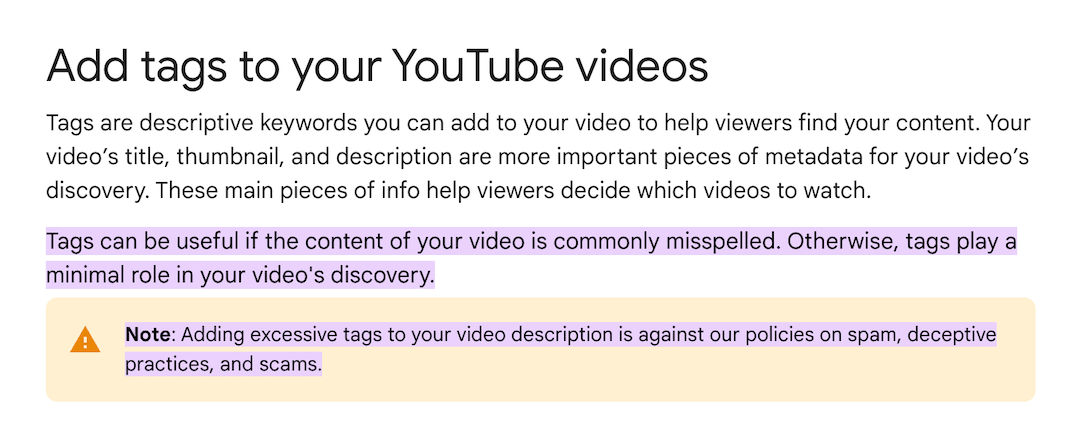
Personally, at Superneat, we choose to align with YouTube’s tag recommendations and don’t add them to our videos or our client’s videos. You do what you think is best—just don’t add excessive tags if you decide to use them.
Tag Resources
Create Attention-Grabbing Thumbnails
Viewers typically notice thumbnails before they look at the title of your video. Use this to your advantage by creating thumbnails that really grab someone’s attention.
Thumbnail Design
Clean and simple is always better than a hot mess. To avoid looking corporate and to stand out more, go with the happy bright colors from your branding palette. Whenever possible, add the person or people from the video.
Quick real-world scenario: We updated a podcast thumbnail template for a client to include both the host and the guest, rather than just the host “or” the guest, and it made a huge difference in video performance (views and engagement). With only one person on the thumbnail, it was difficult for viewers to realize that the video was a conversational podcast with two people.
Thumbnail Copy
The most common thumbnail mistake with B2B organizations is using the same copy from the video title as the thumbnail copy. Don’t do it. I guarantee it’s too much text to cram into your thumbnail design. Plus, this is a chance to vary between the title (more descriptive) and the thumbnail (more catchy).
To make your thumbnail copy catchy, go with something provocative or thought-provoking. I almost have to adopt a clickbait mindset because that helps me. If that works for you, use it. Just make sure the thumbnail copy is relevant to the video content, and not too far-fetched.
Thumbnail Resources
Choose a Relevant Title With Tasteful Keywords
YouTube is a search algorithm, so titles should include the keywords your audience is searching for. And, since tags aren’t the faithful search companion they once were, your title needs to be optimized with keywords.
YouTube titles are just like blog titles. They should:
- Pique someone’s interest so they move to the next step of consuming the content.
- Incorporate the keyword tastefully to avoid disrupting the message you’re conveying.
- Be at the optimal length so the text isn’t cut off (70 characters or less for YouTube titles).
Title Resources
Maximize Your Description Content
Believe it or not, people do read YouTube descriptions. The video itself overshadows this section, and I’d argue that people binge on the comment section more than spend a bunch of time reading the description.
But, that doesn’t mean you should haff-ass your description content. Quite the opposite, you should maximize it.
- Your video description does not need to be a mile long—two paragraphs tops! The first sentence is the most important, so this should be the hook that compels someone to watch your video.
- The next part of your description should be a link extravaganza. Link to related content, whether those are blogs or other YouTube videos. This is also the place to add any links you mentioned in the video, like a gated asset.
- Finally, you should add a few website links. Although you have these links on your channel page (stuff we covered in the setup section above), people will rarely see them because they will spend most of their time in the videos they’re consuming.
Bonus formatting tip: Because YouTube doesn’t offer any bells and whistles with formatting, description formatting takes practice to make all of this information look decent. One of my formatting go-to’s is making description headers bold with asterisks on either side (i.e. *Related Content*).
Description Resources
Avoid Automatic Chapters and Add Your Own
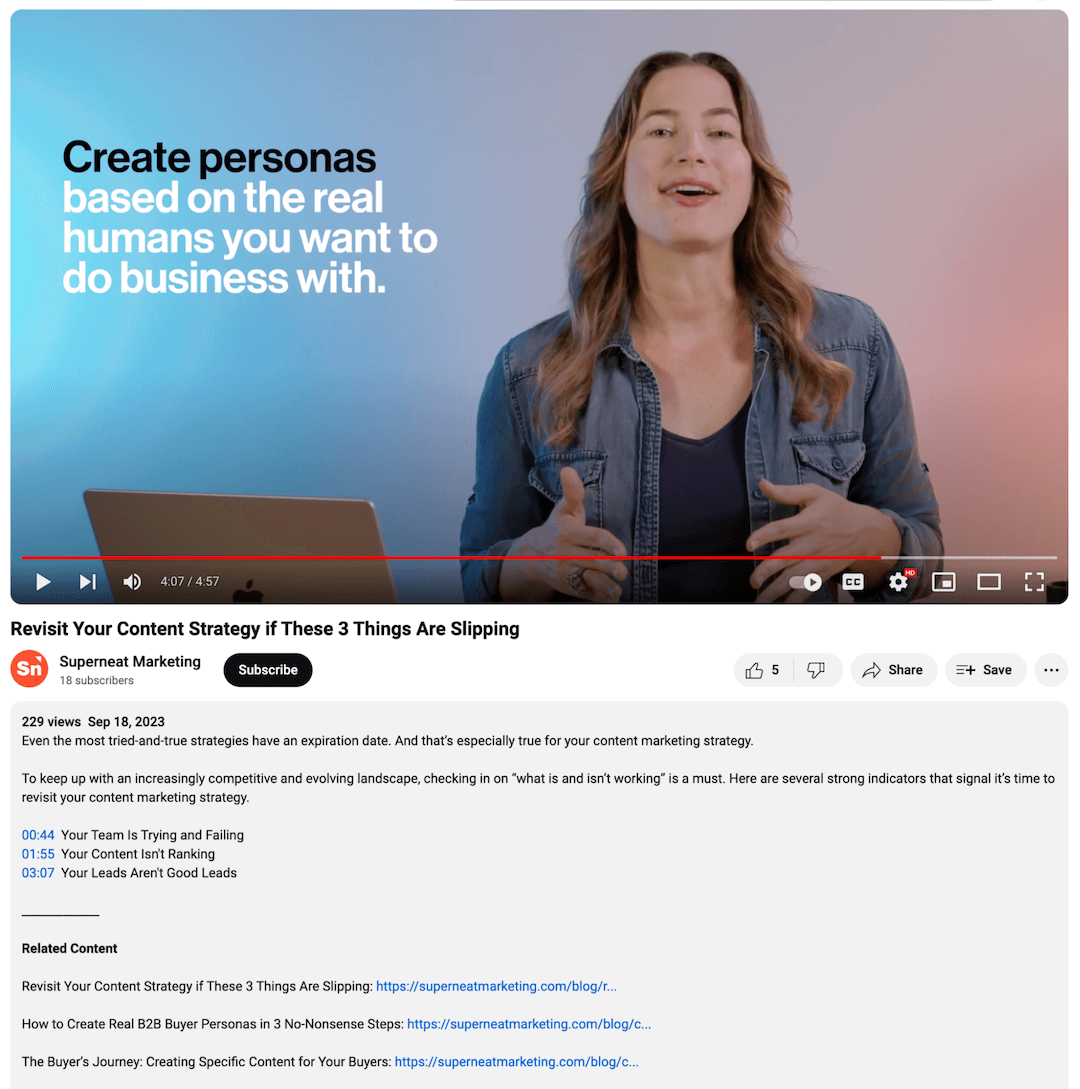
It’s so tempting to use YouTube’s automatic chapters. YouTube makes it so easy to do this, but automatic chapters suck. I urge all of our clients to manually add chapters because I see chapter content mistakes all the time with the auto option.
You’ve invested so much time and resources in this video, so you definitely don’t want chapter typos that make your brand look sloppy. There’s no need to add chapters to videos less than three minutes, but do add them for anything longer.
To manually add your video chapters, simply include the timestamps and titles right in your description.
Chapter Resources
Reinforce Your CTA in a Pinned Comment
CTA links…again? Sure, why the hell not?! With links on your YouTube channel and videos, you’re trying to catch people at every turn. And, since YouTube is so generous with clickable links, you should add links everywhere.
To get the conversation going, it’s a good idea to kick off the comments by adding/pinning a comment as soon as you publish the video to start engaging with your audience. While you’re at it, you might as well include a CTA link.

Because the comment is pinned, it will always stick to the top of the comment section. Pinned comments are a golden opportunity to reinforce your CTA.
Comment Resources
Make Your Videos Interactive
Video is already interactive, but you can take this even further with YouTube’s features. The opportunities to increase engagement and drive conversions are plentiful when you incorporate interactive elements like end screens and info cards.
End screens appear in the last 5-20 seconds of a video and typically include a combo of elements—thumbnails, subscribe buttons, channel icons, and CTA buttons. They’re perfect for promoting other content and encouraging subscriptions. (You can only link to an external website if you’re in the YouTube Partner Program.)
Info cards are more elaborate, where you have specific options to bring into the YouTube mix:
- Video or Playlist Cards: Promote other videos or playlists on your channel to encourage viewers to stick around and watch related content.
- Channel Cards: Promote other YouTube channels to cross-promote content or collaborate with other creators.
- Link Cards: Send viewers to your website to promote an offering or asset, or contact you directly. (Link cards are only available if you’re in the YouTube Partner Program.)
Whether you use end screens, info cards, or all of the above, these elements give you multiple touchpoints to engage and convert viewers.
Interactive Resources
Besides YouTube Channel Optimization, You Need Great Videos
Knowing how to optimize your YouTube channel is crazy important when you’re investing in video marketing. Every detail matters for your video performance and your audience’s enjoyment.
But it’s only one piece of this gigantic puzzle.
Your channel will only be successful when you fill it with genuine, attention-grabbing video content.
